


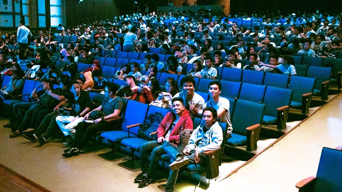
how much clarity a tight deadline can force. The goal was simple to state and tricky to deliver: explain how data visualization and animation work together to help people understand and act. That afternoon became a small turning point in how I teach visual thinking.
Many in the room walked in expecting a session about movies, visual effects, maybe a live Photoshop demo. What they got was a broader frame, a view of visualization as a language for business and research, not just a bag of design tricks. By the end, they recognized there is more to data visualization than meets the eye, a realization I could see in the questions that followed.
What data visualization really does
Data visualization is the researched, intentional design of how information is shown. It is the modern shape of visual communication. When paired with animation, it becomes a guided tour through complexity. Animation is not limited to games or ads. It belongs in business software, websites, and applications where clarity pays the bills.
The principle is plain: the brain spots patterns, trends, and outliers faster when information is shown rather than told. That is why good visualization shortens the distance between raw data and useful action.
Tools beyond the usual charts
People default to bar and pie charts. They work, but they are only the lobby of a very large house. For different questions, you reach for different tools: fever charts for movement over time, heat maps for intensity and distribution, graphics maps for geography, spark lines for tiny trend footprints that fit inside a table. Even Excel can be elegant when used with intent, from layout choices to chart hygiene.
A helpful rule I shared with the group is to pick the form that matches the question. If the question is where, use a map. If it is a matter of how much over time, use a line. If it is a relative proportion, choose a bar, not a pie, unless the total and its parts matter more than comparison across categories. The design follows the job.
Where the business value shows up
Visualization is not decoration. It is a control panel for performance. Teams use it to track KPIs, surface bottlenecks, and spot opportunities. Engineers lean on it to investigate data quality and to validate insights before they reach leadership. Done well, visualization helps identify areas for improvement, understand factors that influence customer behavior, and predict future sales, which is exactly where commercial value compounds.
Imagine a retailer looking at a heat map of store traffic by hour and product zone. The picture reveals two key decisions: staffing patterns and shelf placement. Or consider a dashboard that pairs sentiment analysis with campaign dates. The shapes on the screen tell the story faster than a twelve-page memo, and they do it without spin.
Why animation helps people learn
Static images are snapshots. Animation gives you motion and sequence, which makes causality easier to grasp. When you animate a timeline of inventory swings through the year, seasonality becomes visible. When you animate the growth of customer cohorts, retention and churn stop being abstract ratios and start feeling like living systems. Attention is a scarce resource, especially online. Motion, used lightly and purposefully, keeps the audience with you without dumbing anything down.
A useful mental model, animation is a pointer. It shows the viewer where to look next. It should never be a parade of effects. The moment the motion draws attention to itself instead of the idea, it fails.

s to their majors and interests: communications, marketing, development, and design. The crossover clicked. Visualization was no longer a niche. It was a skill that amplified whatever field they were already pursuing. That shift from tools to outcomes is the real goal of a talk like this.
I closed with a simple invitation: treat visualization as a craft you can practice, not a one-time software training. Read widely in visual communication, build a small library of exemplary charts and maps, and make your own internal style guide so your work looks consistent across projects. For those who wanted to dig deeper, I pointed them to a downloadable deck and to local seminars on analytics and visualization, practical ways to keep the learning curve steep and rewarding.
Practical habits that make visual work better
Keep the audience in the frame. Who is this for, and what do they need to do after looking at this? Strip away anything that does not serve that action.
Respect the numbers. Label cleanly, name sources, avoid chartjunk, and keep ratios truthful. Trust grows when people can audit your work in five seconds.
Start with the question. If the question is wrong, the diagram will be tidy but useless. Write the question at the top of your canvas before you add a single mark.
Use annotation as narrative. Callouts, arrows, and short notes transform a chart into a story. Please do not assume the insight will announce itself.
Iterate in public. Share rough drafts with the team that owns the data and with the stakeholders who need the decision. They will catch what you missed.
These habits sound simple. Practiced consistently, they are a competitive advantage.
The broader lesson
That day at Ateneo confirmed something I still believe. Visualization and animation are not just skills for designers or analysts. They are part of a modern literacy that helps people think together. In an environment flooded with information, the ability to shape data into a clear picture is a leadership function. It removes fog. It speeds up good decisions and slows down bad ones.
Want to explore this further.
If you are building dashboards, pitch decks, or product interfaces and want a second set of eyes, I offer reviews and coaching sessions. If you are starting, I can design a short learning path for your team, covering topics such as chart selection and color discipline, as well as storytelling and executive delivery. The work is practical, and the results show up fast.
Credits and references
- Invitation and context, Ateneo Com Guild, with thanks to Grace Dimaranan.
- Audience expectations, from film and Photoshop to a wider view of visualization.
- Definitions and scope, visualization as visual communication, animation for business software and sites.
- Tool scope and examples, Excel, heat maps, spark lines, and graphics maps.
- Business applications, performance tracking, investigation, forecasting, and customer behavior.
- Further learning items, deck download, seminars, and video list.